Venn Diagrams: 10 tips to supercharge them in the classroom
Ideas to improve one of my favourite task structures
This newsletter is made possible because of Eedi. Check out our brand-new set of diagnostic quizzes, videos, and practice questions for every single maths topic, ready to use in the classroom, and all for free, here.
Welcome to a series of posts where I will share 10 ideas to supercharge some of my favourite student practice activities. We will cover:
Venn Diagrams (this post)
SSDD Problems
Intelligent Practice
A little bit of problem-solving in each lesson
If you find these posts useful, the best way to support this newsletter is to share it with your colleagues. Thanks so much!
Venn Diagrams
Everyone loves a Venn Diagram. Heck, I love them so much that I built a website full of them. Here is one of my favourites:
The basic idea
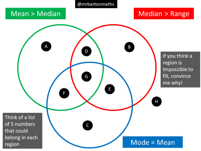
Students try to find examples that can fit in each of the 8 regions. If they cannot find an example to fit in a particular region, can they provide a convincing argument that it is impossible?
Why Venn Diagrams are a good idea
Venn Diagrams provide students with an opportunity to generate their own examples. As I discuss in my Tips for Teachers book, such learner-generated examples are a fantastic test of student understanding as they can reveal misconceptions in a way that teacher-generated questions may miss. Venn Diagrams are also incredibly versatile, meaning that once students are familiar with the basic structure, they can be used for many topics across the year.
Venn Diagrams: 10 top tips
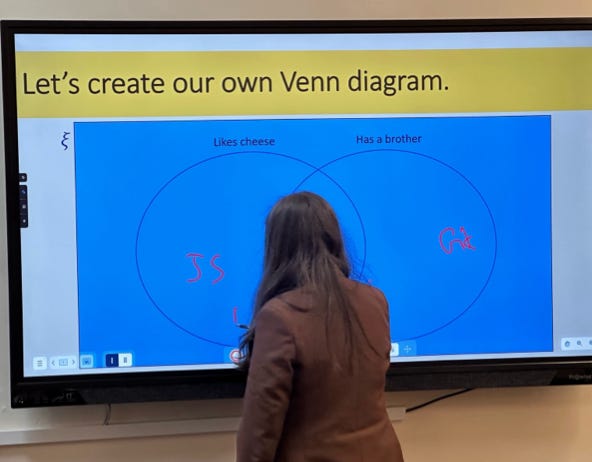
Always start with a basic example to ensure students are secure with the structure of a Venn Diagram. We want our students to be as fluent as possible in terms of knowing exactly what each region of a Venn Diagram means, so that when we change the content to something more challenging, students can divert their attention to thinking about the content and not the Venn Diagram itself. Here is an example from my own school, where each student had to put their initials in the correct region:
Always do a double Venn Diagram before you do a triple one. Even though I want to get onto the rounding Venn Diagram shared at the top of this post, I will warm students up with a double Venn Diagram like this one:
This helps to identify any misconceptions or misunderstandings with the Venn Diagram structure, or the subject content (rounding, in this case), which might be more difficult to unpick in the weeds of an epic triple Venn. It also makes it more likely students will taste some success, which should help motivate them to keep going at the challenge that follows.
Dan Rose takes this one step further. He asks his students to complete a double Venn Diagram first, then reveals the third circle and its label, and challenges students to see which examples from their double Venn will need to move and which can stay!
Always start with an example the class does together. Let’s look at the double Venn Diagram above. Pick a student and ask them to choose their favourite non-integer between 20 and 40 (everyone has one). Let’s say they go for 32.68. Write this on the board and challenge students to decide on their own which region they think it belongs in. Get them to write their choice of letter on their mini-whiteboards, hover them face down, and show you in 3, 2, 1… Then ask students to place their boards in between them and discuss their answers and reasoning. If the vast majority of students have got the right answer, you can confirm and quickly move on, confident in the knowledge that students know what they are doing and have tasted some success. If there is an issue, you might need to pause, do some reteaching, and pick up the example when understanding is secure.
Speaking of mini-whiteboards, I always ask my students to do their working out on these and then record their answers on a blank copy of the Venn Diagram that I have printed out on paper. Mini-whiteboards are a great vehicle for students to do the kind of messy thinking and experimentation often needed to crack a Venn Diagram. As discussed above, they also support paired discussions and collaboration more so than with books or paper.
Students can work independently on the Venn Diagram, or collaborate. But my favourite is the 4-2 approach. This is where students work on their own, in silence, for 4 minutes, and then have 2 minutes of collaboration with their partner, before the cycle repeats again. I find 4 minutes is sufficient time for students to do some thinking on their own without being dominated by an eager partner, and 2 minutes is sufficiently short for the students to have a positive, focused paired discussion to compare their answers and their thinking.
If students are struggling, have some examples ready for students to sort into regions. For example, using the Venn Diagram below, I could ask a struggling student where they think 3/5 belongs. Sorting is easier than generating one’s own examples and should help students get back into the activity. Indeed, I have seen teachers begin with 8 examples for students to sort into regions before asking them to generate their own examples.
If students complete the Venn Diagram, a nice challenge is to ask them to come up with an additional example for each region. This may appear a bit of a throwaway extension, but generating multiple examples can help students move towards generalisation. Building on this, I like to ask students who have finished to think of the most interesting example they can for a particular region, whatever they consider interesting to mean. This prompt compels students to consider boundary examples, and is a revealing insight into the strength of their understanding. Give it a go yourself. Can you come up with three examples for Region D in the fractions Venn Diagram above? What is the most interesting example you can think of?
The ultimate challenge, of course, is to ask students to create their own Venn Diagram on the current topic. You could be even more prescriptive, and ask that their Venn Diagram has, for example, exactly one region that is impossible to fill.
An interesting strategy to suggest to students is to see if they can change each example as little as possible to generate an example for a different region. For example, say a student comes up with 5, 5, 5, 10, 20 for region A in the Venn Diagram below. Then what is the smallest change they can make to that example so they now have an example for region B, and so on? This taps into the power of variation theory, enabling students to focus on the critical aspects of examples.
When assessing students’ work, we have the inherent problem with all learner-generated examples: there are potentially an infinite number of correct and incorrect examples for each region, so banging the answers on the board and asking students to mark them themselves will not work. Instead, ask students to swap their completed Venn Diagram with their partner. I give them the following instructions:
Tick each example you think is in the correct region
* any you think might be wrong
Discuss the *s with your partner
If you still disagree, put your hand up
You can guarantee that any remaining starred examples will make for fruitful whole-class discussion.
Three of my favourite Venn Diagrams
Challenge your students with some of these… or enjoy trying them yourself. And remember, you can find all my Venn Diagram activities here.
Area and perimeter:
Sequences:
Equations of straight line graphs:
What is your experience with Venn Diagrams?
Do you like any of these ideas?
Do you have any extra tips to share?
Let me know in the comments below!
🏃🏻♂️ Before you go, have you…🏃🏻♂️
… checked out our incredible, brand-new, free resources from Eedi?
… read my latest Tips for Teachers newsletter about introducing checks for listening using non-subject content?
… listened to my latest podcast about feedback cycles, lesson observations and Exit Tickets?
… considered booking some CPD, coaching, or maths departmental support?
… read my Tips for Teachers book?
Thanks so much for reading and have a great week!
Craig


